If you are using Visual Composer or WPBakery page builder and wondering to create a two columns section like 1st column is the image and 2nd column is text then 1st column is text and 2nd column is the image as seen in the screenshot
Apparently, you can do this layout by adding first a row, make it 2 columns, add an image to the 1st column and add text to the 2nd column. Then again add the second row make it 2 columns, add text to the 1st column and add an image to the 2nd column. as seen on the screenshot
This will create the same layout as you see in the first screenshot above. But, if you see in mobile the layout will be fist image then text in the first section and first text then image in the second section as you can see in the mobile layout screenshot below
Now, for mobile device, if you want to display the image on top and text on the bottom to each section, or text on top and image on the bottom to each section you to use 2 classes vc_col-sm-push-6 and vc_col-sm-pull-6 to Reverse Column Order in Visual Composer
How to Reverse Column Order or Swap Columns Order in Visual Composer
(This Reverse it in desktop view and remains for mobile view)
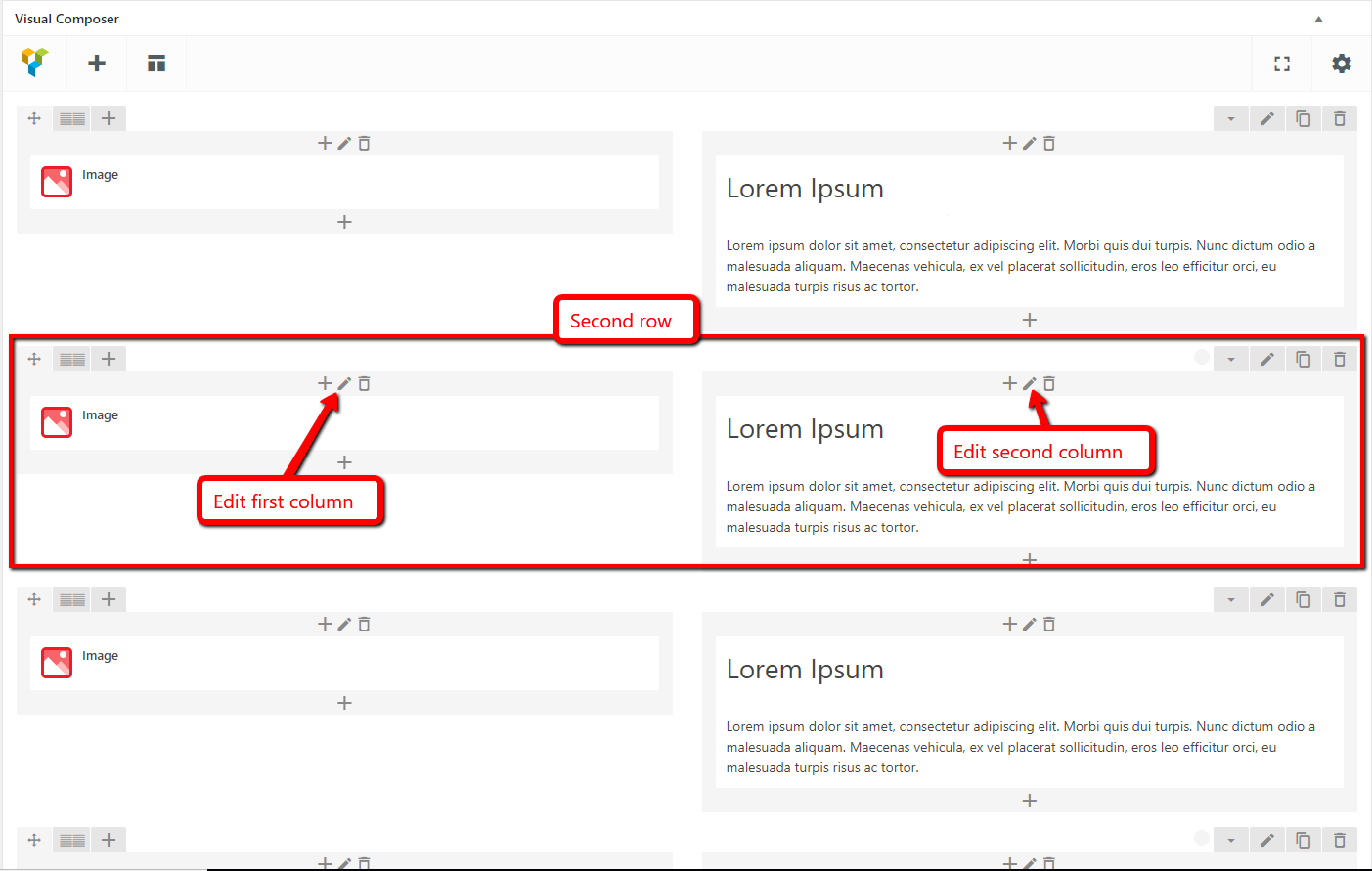
First, add a row of two columns then add the image to the first column and text to the second column (if you want to display image top and text bottom in mobile), add another row and do the same. As seen on the screenshot
In the above screenshot, you can see the image in the first column and text in the second column in each row. (if you want to display text top and image bottom in mobile then add text to the first column and the image to the second column.)
Now, Edit the second row and add class vc_col-sm-push-6 to the first column then edit the second column and add the class vc_col-sm-pull-6 to the second column of the second row, as seen on the screenshot


This will Reverse the Column and move the left column to move right. Do the same to 4th row, 6th row, all the even rows. Then, It will be displayed like Row 1 = Image + Text, Row 2 = Text + image, Row 3 same as Row 1, Row 4 Same as Row 2.
You can see the Desktop layout in the screenshot below
For Mobile devices, All Rows will be the same First Image then text.
